Blog

Peter F. Gaito & Associates, also known as PFGA, is now located at 102 Waller Avenue. A thriving architectural firm, the company assists customers with master planning, commercial space safety, and residential lifestyle realization. When the company needed a new blade sign in White Plains, NY, its management team contacted our sign shop to assist with the project.
Using an Eye-Catching Blade Sign to Advertise the Firm

The client requested a sign that would stand out from the locations around the building. A blade sign is a fantastic alternative because its message targets consumers coming from either direction of the street. Besides that, these signs jut out from the façade, which makes them even more visible.
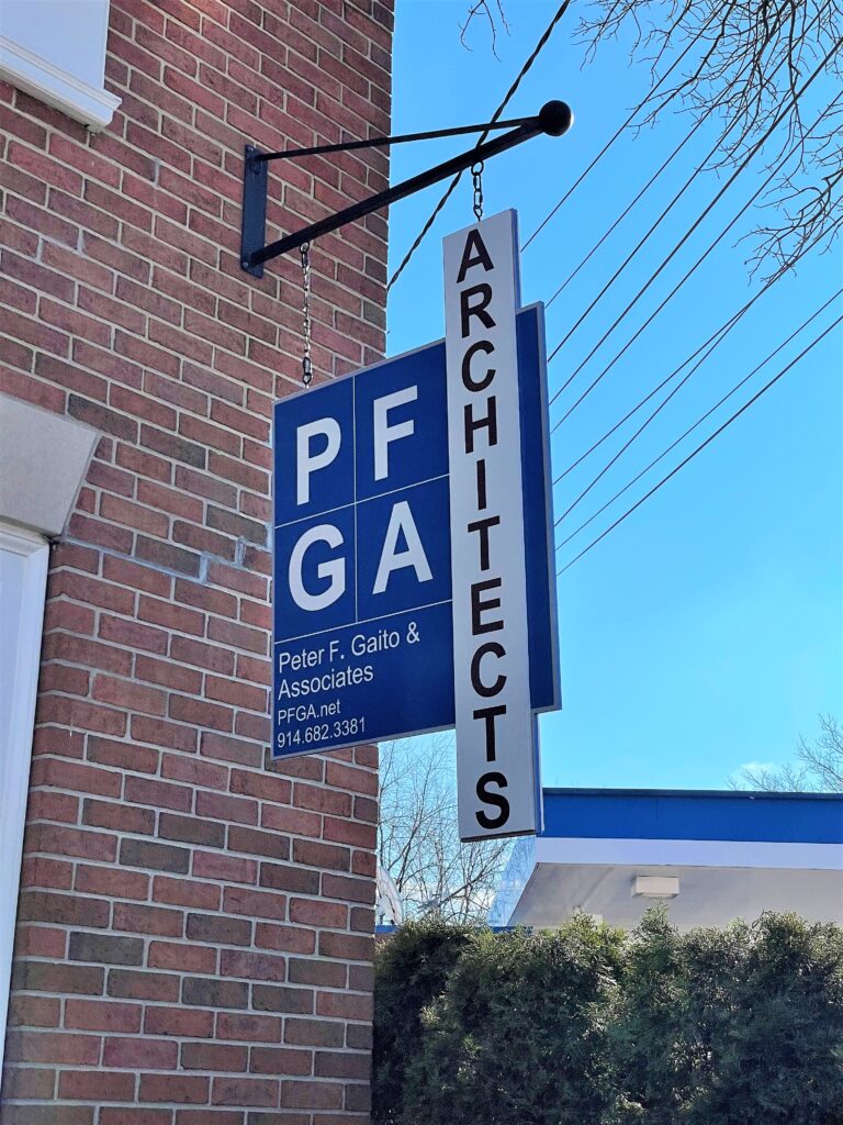
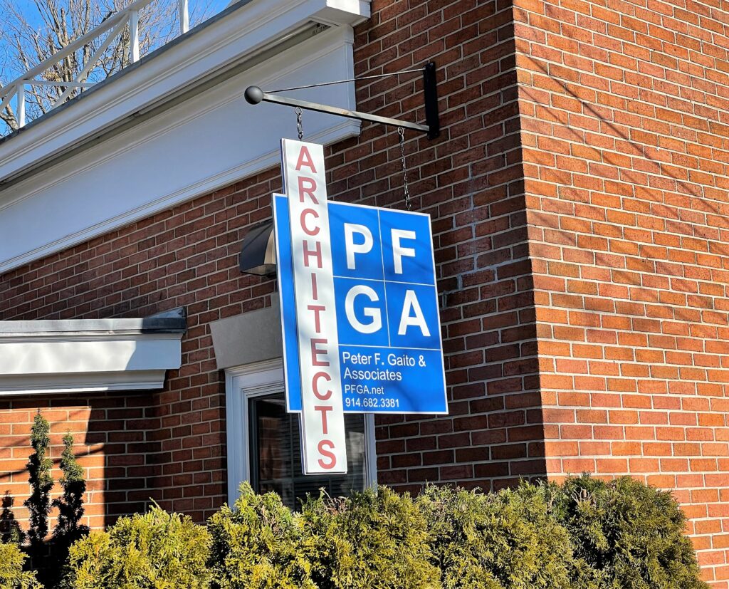
We started the project with the design of a board. It displays the company’s name and logo with a white print against a blue background. A vertical side panel identifies the business as an architectural firm. This panel extends past the board’s top and bottom, which creates an additional attention-getter. Finally, we mounted a decorative wrought iron arm from which we lowered the sign with two chains.
Now, there is a slight movement that catches the eye. Moreover, the white and blue colors contrast nicely with the building’s brick façade. This combination makes it a snap for the architect to stand out and advertise the firm’s presence.
Do You Need a Blade Sign? We Can Help!

It is fair to say that blade signs are among the most underappreciated signage solutions. At the same time, they are perhaps the most customizable ones.
- Shape. Which shape is right for your business? Most clients request squares or rectangles. However, you do not have to stop there. If you envision a circle, oval, or fully custom-cut form that mimics your logo, we can most certainly accommodate this direction.
- Go big. In addition to shape, you also get to select the size of the product. Retail clients at malls have done well with smaller rectangles that remind of street signs. However, you might also go so tall that your blade takes up half or more of the façade’s height.
- Go bright. When the blade becomes your primary business sign, illumination is a good idea. In this setting, you might consider the design of a double-sided box cabinet with built-in LEDs. Another choice is the design of a metal blade with push-through acrylic letters for a 3D look.
- Material options. When there is no need for built-in lighting, you have additional material options. Examples include Dibond, acrylic, and high-density urethane (HDU). Wood is another alternative.
Find out More about Advertising with a Blade Sign in White Plains, NY
Have we piqued your interest in complementing your standard building sign with a blade marker? Maybe you are considering making it your primary signage product. Our specialists can assist you with the design of the look. Invite our team to conduct a site survey, which allows us to advise you on the blade’s placement and size.
Call today to schedule your appointment!


