

Blog
There is a lot of emphasis in the digital world on using the best colors on a website in order to get conversions on a website. These conversions are most often sales, as it is the most common goal of websites online. However, other conversions can include getting someone to read through a blog or watch the videos that are posted to a page.
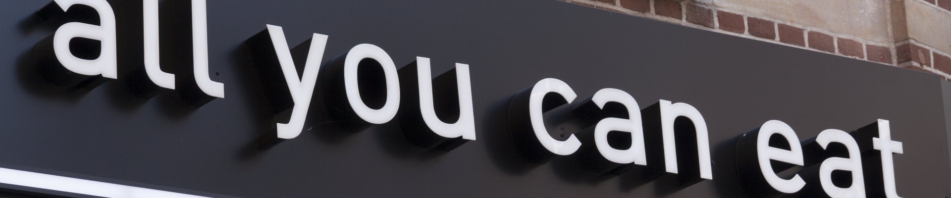
While there is a lot of focus on these colors for the internet, those same principles can be applied to business signs. After all, the entire intention behind a business sign is to create a conversion. Of course, in this case, that conversion turns into getting someone to enter the location as opposed to reading a blog or making a purchase through a website. But using those same principles could get the real-life conversion of a sale by getting a customer in your door.
Color Coordination and Conversions
There is no real best color to use for better conversion rates online, despite the many articles claiming to have cracked the code. However, there is a way to get more interest in where conversions take place. The psychological term for this phenomenon is the Isolation Effect. In this principle, the item which stands out like a “sore thumb” is the one that is remembered.
But how can this be applied to a business sign? Pretty easily.
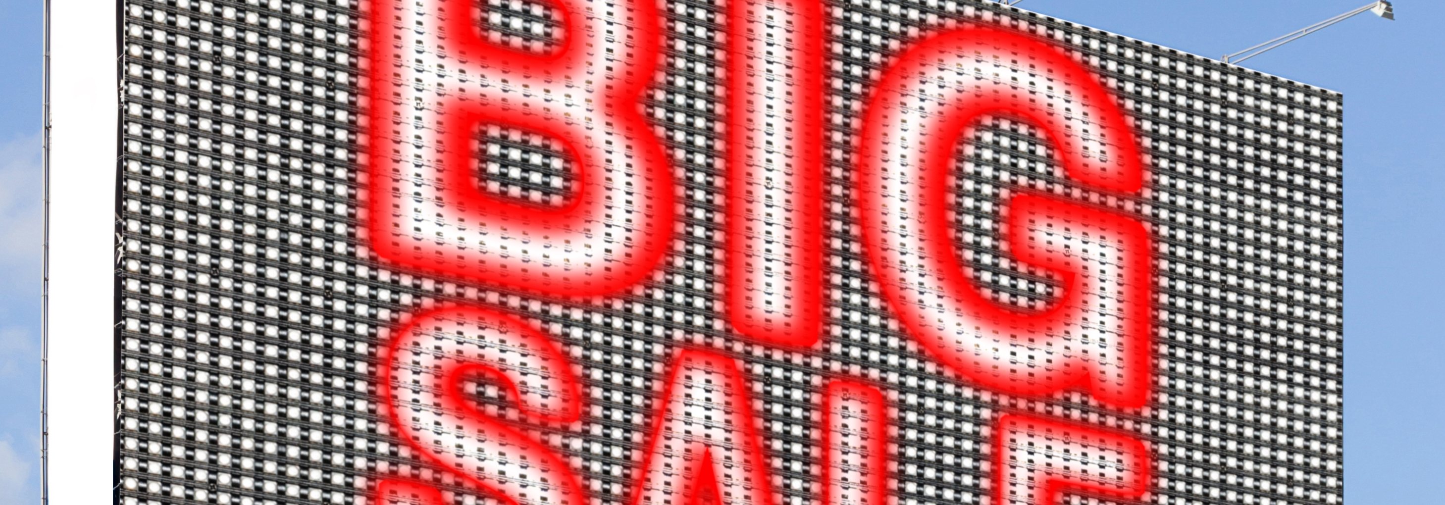
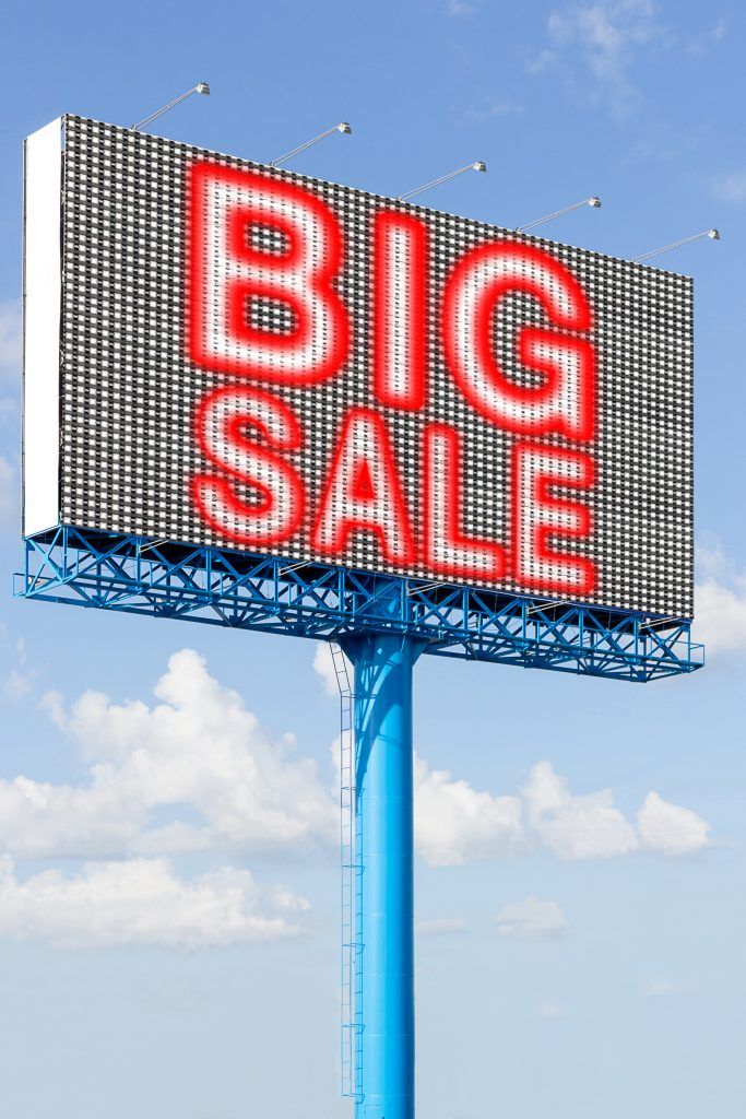
An example of this principle used online is making a generally soft blue theme for the website, then making the purchase button a bright red. This makes it into its own perceived island and will stick out very easily. When trying to achieve the same look in your building, there are a few ways to go.
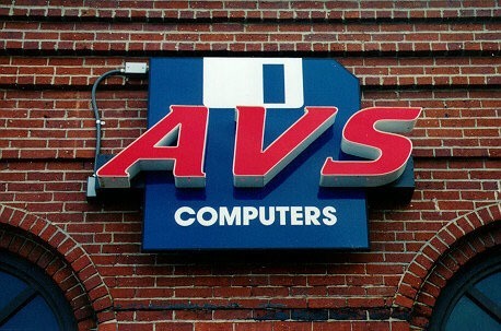
Using window graphics can be a great way to achieve this. By making a generally muted toned graphic then having the sales highlighted in a bold red or similar color, you are communicating that the information is important enough to stand alone, which will make customers want to find out more. On the other hand, having the text of a building sign in a more muted, but still easy to read, color, then adding a bold red for a symbol indicated the symbol is the most important aspect. This can be effective for plumbers and computer repair shops, as their symbols are easy to discern and can stand out easily, leaving a clear impression in a passerby’s mind.
Looking to stand out? We can help! Contact our team today with your signage needs and we will work on making your business stand out from the pack with our options in colors, graphics and fonts.